
Andrew R Joyce, PhD and Catherine C Vick, MS
By now, you have been inundated with COVID-19 statistics and curves. The goal of social distancing and isolation is to flatten the curve. These graphs, generated using data from Johns Hopkins University, show the current confirmed case counts for several nations or more localized hotspots (Hubei, China and New York state) (Figure 1), and also the United States confirmed case counts organized by individual state and census division.(Figure set 2) These differentiations are important, as not all states have the same number of confirmed cases, and not all curves follow the similar trajectories.
Figure 1 shows that the Hubei, China curve has flattened and Italy appears to be moving in that direction. Most other curves in this plot continue to indicate rapid or steady growth in confirmed case counts with the United States leading by far with respect to both total cumulative and new daily cases.
Figure 1. National and regional hotspot cumulative confirmed case counts (with new cases represented by bars along the x-axis).
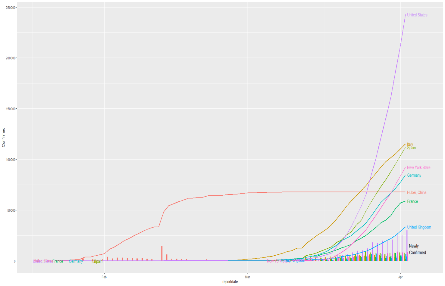
Figure 2. State cumulative confirmed case counts split by census division and state (with new cases represented in bars along x-axis).

Figure 3 shows cumulative deaths attributed to COVID-19 in select countries and other more localized hotspots. Currently, Italy has the greatest number of deaths, followed by Spain, with the United States ranking third. It is important to note, however, that Italy and Spain have been dealing with sizable outbreaks of COVID-19 for longer than the United States. As with cumulative cases, the Hubei, China curve has flattened; however, all others continue to indicate rapid or steady increases.
Figure 3. Cumulative deaths for select countries and regional hotspots with new deaths represented in bars.
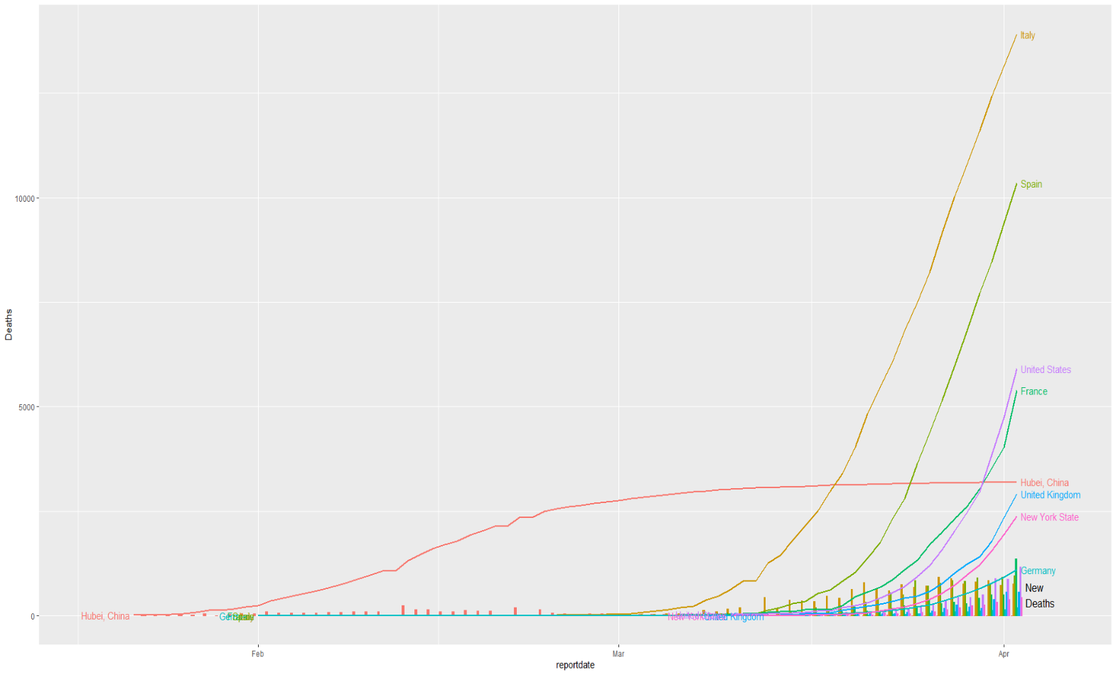
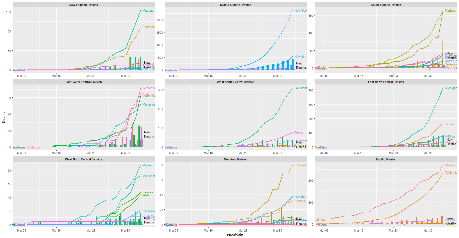
Figure 4 shows cumulative deaths by United States census division and state, with new deaths represented in bars along the x-axis.
Figure set 4. Cumulative deaths by census division and state, with new deaths represented in bars.
Notably, these graphs are based on cumulative counts to show the trajectories of the curves. They do not show the infection rates based on overall population, or the death rates based on confirmed infections. These curves likely understate overall population infection rates, as many of those believed to be infected who are asymptomatic or with only mild symptoms have likely not been tested. The graphs do, however, show the upward trend in confirmed cases and deaths in the United States and several other Western nations, and provide a visual representation of the very curves that need to flatten. Additionally, these curves reveal trends over time, and show how quickly both infections and deaths double, thus serving as indicators of the magnitude of consequent impacts on both communities and healthcare systems.
While multiple pharma, device, and other companies rush to fill the needs for vaccines, treatments, testing, ventilators and other support, COVID-19 is a novel coronavirus that is still being characterized. We do not have prevention methods or targeted treatments in place. In addition, we cannot be certain how many people have COVID-19, but do not know it. As a result, our current best chance to flatten these curves, not overwhelm our healthcare systems, and stop the spread of the disease is social distancing and isolation. This is difficult for everyone, but if we all work together, we will get through it.